What Are Data Analytics?
A quick aside before I dive into this post: data analytics is a vague term
that has become popular in recent years. Think of a data analytic as the
output of any data analysis you perform. For example, a pivot table or a pie
chart could be a data analytic.
Data analysis is a process that utilizes statistics and other mathematical methods to discover useful information within datasets. This involves examining, cleaning, transforming, and modeling data so that you can use the data to support an opinion, create more useful viewpoints, and gain knowledge to implement into audit planning or risk assessments.
One of the common mistakes that managers (and anyone new to the process) make is assuming that everything involved with this process is "data analytics". In fact, data analytics are only a small part of the process.
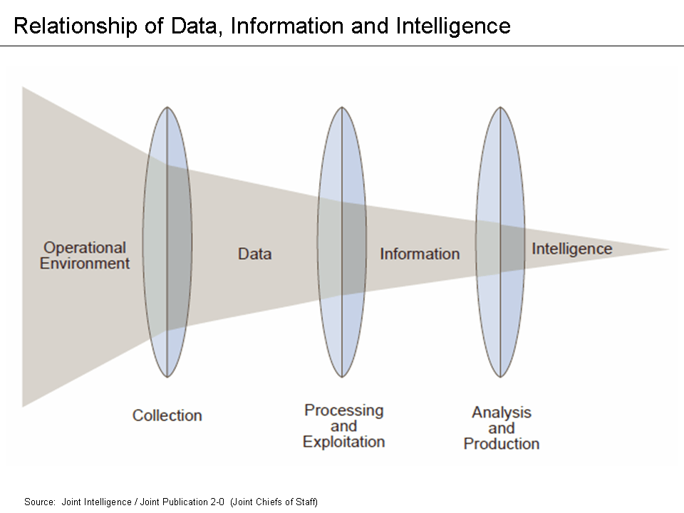
See Figure 1 for a more accurate representation of where data analysis sits within the full process. This means that data analysis does not include querying or extracting data, selecting samples, or performing audit tests. These steps can be necessary for an audit (and may even be performed by the same associates), but they are not data analytics.
Current Use of Analytics in Auditing
While data analysis has been an integral part of most businesses and departments for the better part of the last century, only recently have internal audit functions been adopting this practice. The internal audit function works exclusively to provide assurance and consulting services to the business areas within the firm (except for internal auditing firms who are hired by different companies to perform their roles).
Internal Auditing helps an organization accomplish its objectives by bringing a systematic, disciplined approach to evaluate and improve the effectiveness of risk management, control and governance processes.
- The IIA's Definition of Internal Audit
Part of the blame for the slow adoption of data analysis can be attributed to the fact that internal auditing is strongly based on tradition and following the precedents set by previous auditors. However, there can be no progress without auditors who are willing to break the mold and test new audit techniques. In fact, as of 2018, only 63% of internal audit departments currently utilize data analytics in North America. This number should be as close as possible to 100%. I have never been part of an audit that would not have benefited from data analytics.
So, how do internal audit functions remedy this situation? It's definitely not as easy as walking into work on Monday and telling your Chief Audit Executive that you're going to start implementing analytics in the next audit. You need a plan and a system to make the analysis process as effective as possible.
The DELTA Model
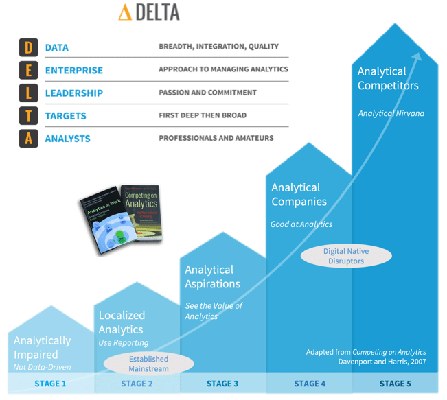
One of the easiest ways to experiment with data analytics and gain an understanding of the processes is to implement them within your own department. But how do we do this if we've never worked with analysis before? One of the most common places to start is to research some data analysis models currently available. For this post, we'll take a look at the DELTA model. You can take a look at Figure 2 for a quick overview of the model.
The DELTA model sets a few guidelines for areas wanting to implement data analytics so that the results can be as comprehensive as possible:
- Data: Must be clean, accessible, and (usually) unique.
- Enterprise-Wide Focus: Key data systems and analytical resources must be available for use (by the Internal Audit Function).
- Leaders: Must promote a data analytics approach and show the value of analytical results.
- Targets: Must be set for key areas and risks that the analytics can be compared against (KPIs).
- Analysts: There must be auditors willing and able to perform data analytics or else the system cannot be sustained.
Finding the Proper KPIs
Once the Internal Audit Function has decided that they want to start using data analytics internally and have ensured they're properly set up to do so, they need to figure out what they will be testing against. Key Performance Indicators (KPIs) are qualitative or quantitative factors that can be evaluated and assessed to determine if the department is performing well, usually compared to historical or industry benchmarks. Once KPIs have been agreed upon and set, auditors can use data analytics to assess and report on these KPIs. This allows the person performing the analytics the freedom to express opinions on the results, whereas the results are ambiguous if no KPIs exist.
It should be noted that tracking KPIs in the department can help ensure you have a rigorous Quality Assurance and Improvement Program (QAIP) in accordance with some applicable standards, such as IPPF Standard 1300.
The chief audit executive must develop and maintain a quality assurance and improvement program that covers all aspects of the internal audit activity.
- IPPF Standard 1300
Additionally, IPPF Standard 2060 discusses reporting:
The chief audit executive must report periodically to senior management and the board on the internal audit activity's purpose, authority, responsibility, and performance relative to its plan and on its conformance with the Code of Ethics and the Standards. Reporting must also include significant risk and control issues, including fraud risks, governance issues, and other matters that require the attention of senior management and/or the board.
- IPPF Standard 2060
The hardest part of finding KPIs is to determine which KPIs are appropriate for your department. Since every department is different and has different goals, KPIs will vary drastically between companies. To give you an idea of where to look, here are some ideas I came up with when discussing the topic with a few colleagues.
- Efficiency/Budgeting:
- Audit hours to staff utilization ratio (annual hours divided by total annual work hours).
- Audit hours compared to the number of audits completed.
- Time between audit steps or to complete the whole audit. E.g., time from fieldwork completion to audit report issuance.
- Reputation:
- The frequency that management has requested the services of the IAF.
- Management, audit committee, or external audit satisfaction survey results.
- Education, experience, certifications, tenure, and training of the auditors on staff.
- Quality:
- Number and frequency of audit findings. Assign monetary or numerical values, if possible.
- Percentage of recommendations issued and implemented.
- Planning:
- Percentage or number of key risks audited per year or per audit.
- Proportion of audit universe audited per year.
Data Analysis Tools
Finally, to be able to analyze and report on the data analysis, auditors need to evaluate the tools at their disposal. There are many options available, but a few of the most common ones can easily get the job done. For example, almost every auditor already has access to Microsoft Excel. Excel is more powerful than most people give it credit for and can accomplish a lot of basic statistics without much work. If you don't know a lot about statistics but still want to see some of the more basic results, Excel is a great option.
To perform more in-depth statistical analysis or to explore large datasets that Excel cannot handle, auditors will need to explore other options. The big three that have had a lot of success in recent years are Python, R, and ACL. ACL can be used as either a graphical tool (point and click) or as a scripting tool, where the auditor must write the scripts manually. Python and the R-language are solely scripting languages.
The general trend in the data analytics environment is that if the tool allows you to do everything by clicking buttons or dragging elements, you won't be able to fully utilize the analytics you need. The most robust solutions are created by those who understand how to write the scripts manually. It should be noted that as the utility of a tool increases, it usually means that the learning curve for that tool will also be higher. It will take auditors longer to learn how to utilize Python, R, or ACL versus learning how to utilize Excel.
Visualization
Once an auditor has finally found the right data, KPIs, and tools, they must report these results so that actions can be taken. Performing in-depth data analysis is only useful if the results are understood by the audiences of the data. The best way to create this understanding is to visualize the results of the data. Let's take a look at some of the best options to visualize and report the results you've found.
Some of the most popular commercial tools for visualization are Microsoft PowerBI and Tableau Desktop. However, other tools exist such as JMP, Plotly, Qlikview, Alteryx, or D3. Some require commercial licenses while others are simply free to use. For corporate data, you may want to make sure that the tool does not communicate any of the data outside the company (such as cloud storage). I won't be going into depth on any of these tools since visualization is largely a subjective and creative experience, but remember to constantly explore new options as you repeat the process.
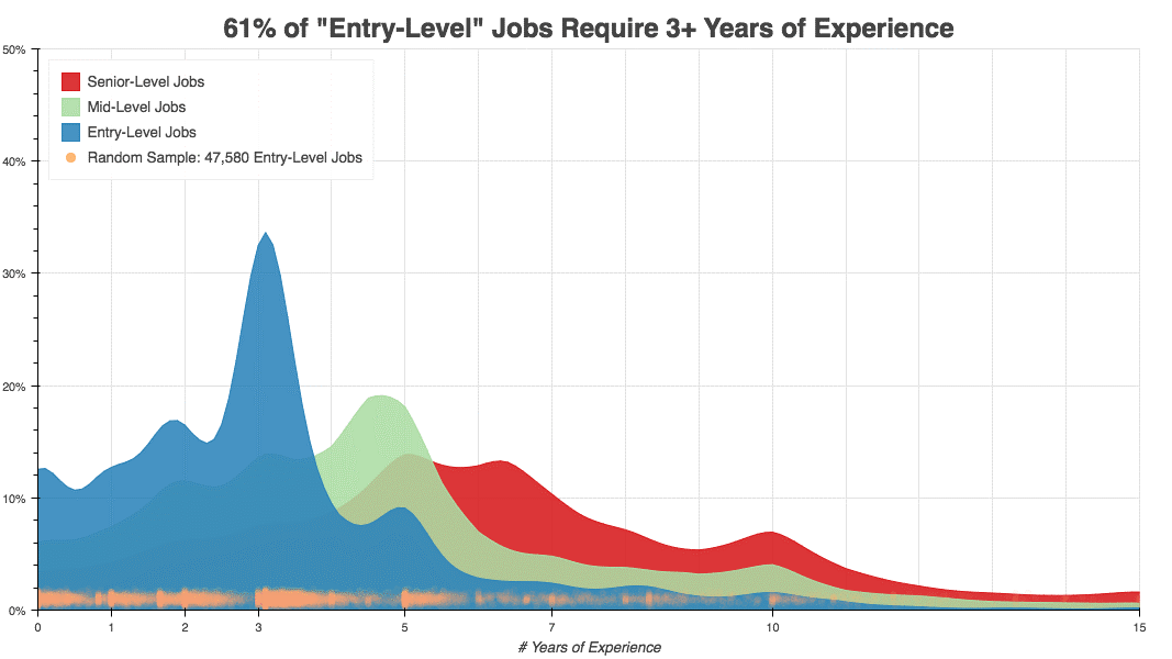
Lastly, let's take a look at an example of data visualization. This example comes from a blog post written by Kushal Chakrabarti in 2018 about the percent of entry-level US jobs that require experience. Figure 3 shows us an easy-to-digest picture of the data. We can quickly tell that only about 12.5% of entry-level jobs don't require experience.
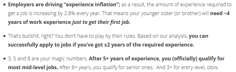
This is the kind of result that easily describes the data for you. However, make sure to include an explanation of what the results mean. Don't let the reader assume what the data means, especially if it relates to a complex subject. Tell a story about the data and why the results matter. For example, Figure 4 shows a part of the explanation the author gives to illustrate his point.
Wrap-Up
While this is not an all-encompassing program that you can just adopt into your department, it should be enough to get anyone started on the process of understanding and implementing data analytics. Always remember to continue learning and exploring new options as your processes grow and evolve.