Background Information
The dataset (obtained from Kaggle) used in this article contains a list of countries around the world, their happiness rankings and scores, as well as other national scoring measures.
Fields include:
- Overall rank
- Country or region
- GDP per capita
- Social support
- Healthy life expectancy
- Freedom to make life choices
- Generosity
- Perceptions of corruption
There are 156 records. Since there are ~195 countries in the world, we can see that around 40 countries will be missing from this dataset.
Install Packages
As always, run the install command for all packages needed to perform
analysis.
!
Import the Data
We only need a couple packages to create a choropleth map. We will use Folium, which provides map visualizations in Python. We will also use geopandas and pandas to wrangle our data before we put it on a map.
# Import the necessary Python packages
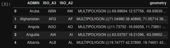
To get anything to show up on a map, we need a file that will specify the boundaries of each country. Luckily, GeoJSON files exist (for free!) on the internet. To get the boundaries of every country in the world, we will use the GeoJSON link shown below.
GeoPandas will take this data and load it into a dataframe so that we can easily match it to the data we're trying to analyze. Let's look at the GeoJSON dataframe:
# Load the GeoJSON data with geopandas
=
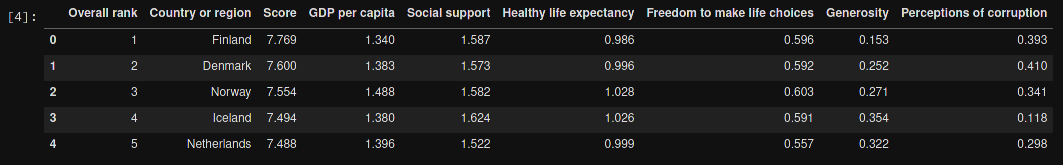
Next, let's load the data from the Kaggle dataset. I've downloaded this file, so update the file path if you have it somewhere else. After loading, let's take a look at this dataframe:
# Load the world happiness data with pandas
=
Clean the Data
Some countries need to be renamed, or they will be lost when you merge the
happiness and GeoJSON dataframes. This is something I discovered when the map
below showed empty countries. I searched both data frames for the missing
countries to see the naming differences. Any countries that do not have records
in the happy_data df will not show up on the map.
# Rename some countries to match our GeoJSON data
# Rename USA
=
=
# Rename Tanzania
=
=
# Rename the Congo
=
=
# Rename the DRC
=
=
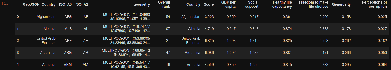
Merge the Data
Now that we have clean data, we need to merge the GeoJSON data with the
happiness data. Since we've stored them both in dataframes, we just need to call
the .merge() function.
We will also rename a couple columns, just so that they're a little easier to use when we create the map.
# Merge the two previous dataframes into a single geopandas dataframe
=
# Rename columns for ease of use
=
=
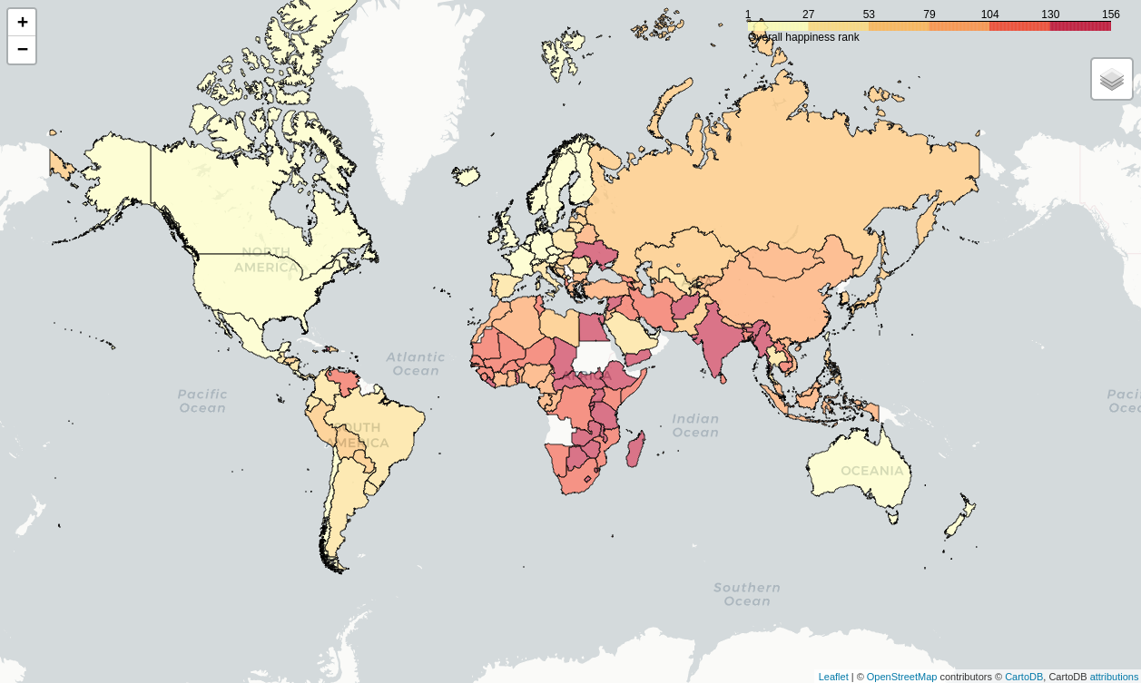
Create the Map
The data is finally ready to be added to a map. The code below shows the simplest way to find the center of the map and create a Folium map object. The important part is to remember to reference the merged dataframe for our GeoJSON data and value data. The columns specify which geo data and value data to use.
# Assign centroids to map
=
=
# Creating a map object
=
# Creating choropleth map
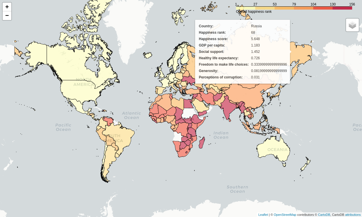
Let's look at the resulting map.
Create a Tooltip on Hover
Now that we have a map set up, we could stop. However, I want to add a tooltip
so that I can see more information about each country. The tooltip_data code
below will show a popup on hover with all the data fields shown.
# Adding labels to map
=
=
# Display the map
The final image below will show you what the tooltip looks like whenever you hover over a country.