In this project, I am going to show you how to use Tableau Public for free to create simple dashboards.
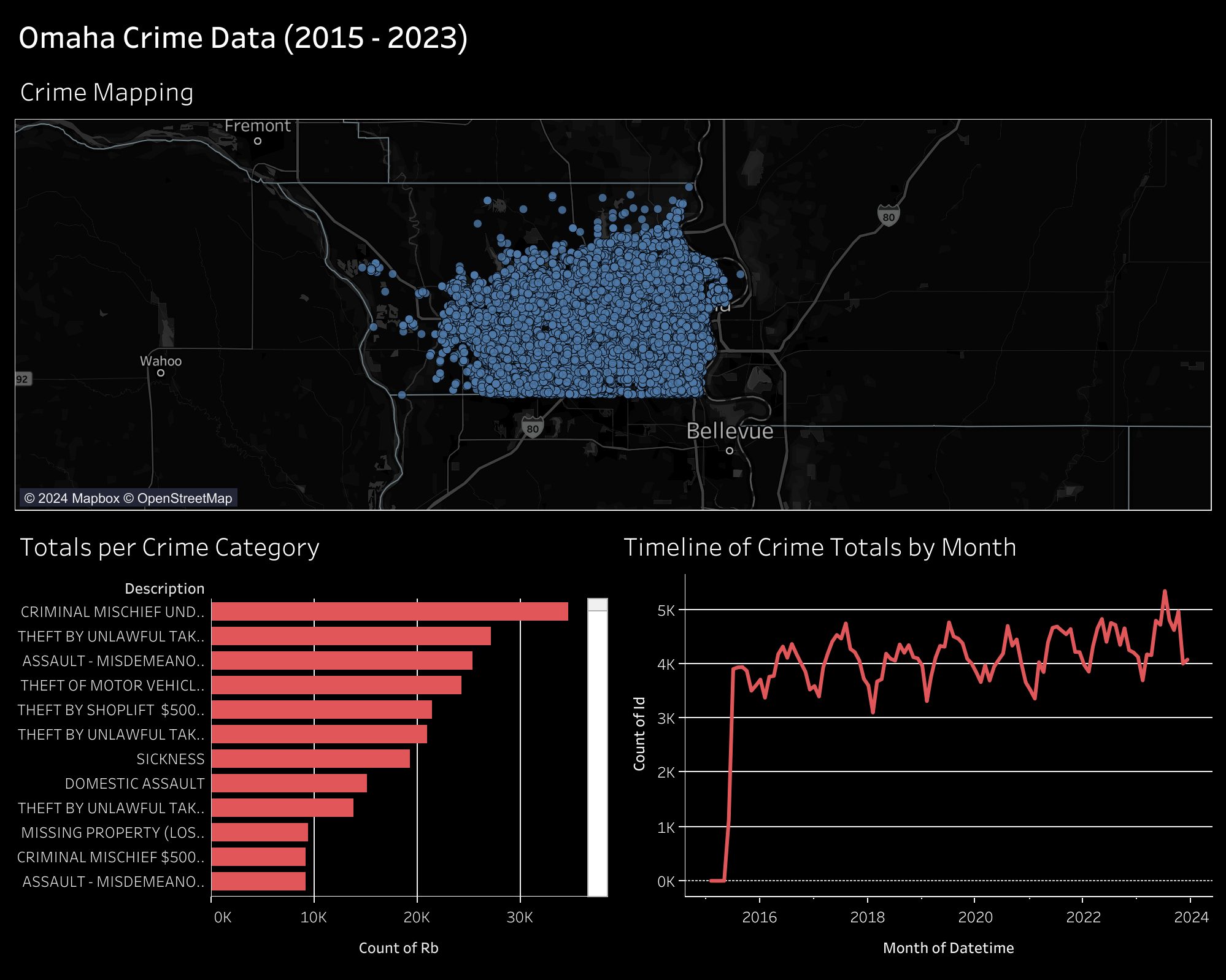
I will be creating simple visuals from an Omaha crime data set and combining them to create the dashboard below. You can view this dashboard interactively online here: Omaha Crime Data (2015 - 2023).
Gather the Data
You can download incident data from the Omaha Police Department on their Incident Data Download page. They currently have files for the years 2015 through 2023.
Each file will be downloaded as a CSV file, approximately 3 MB - 8 MB.
Clean and Transform the Data
I have used Python to combine the files into a single CSV file, as well as
adding a custom datetime column. You could do this step in any software you
prefer, but I prefer Python as its free, easy to use, and has a plethora of
support resources online.
Start by opening a terminal, navigating to your Downloads directory, and creating a python script.
Within the Python script, paste the following:
# Import modules
# Import the data
= r
=
=
=
=
# Create a combined datetime column
=
# Export the combined data
Once pasted, save and close the file. You can execute the file like so:
After this, you should have a combined data file that contains all incidents between 2015 and 2023. Mine was approximately 55 MB.
Tableau Public
Tableau Public is a free-to-use web application that allows you to create visualizations by uploading data sources. Note that there's no way to keep the data and visualizations private, so don't upload anything private.
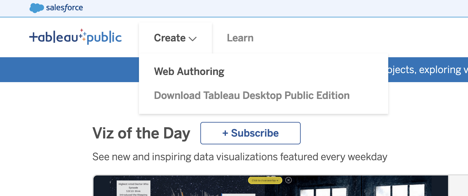
After creating an account, you can click the Create > Web Authoring link to
create your first visualization.
Upload the Data
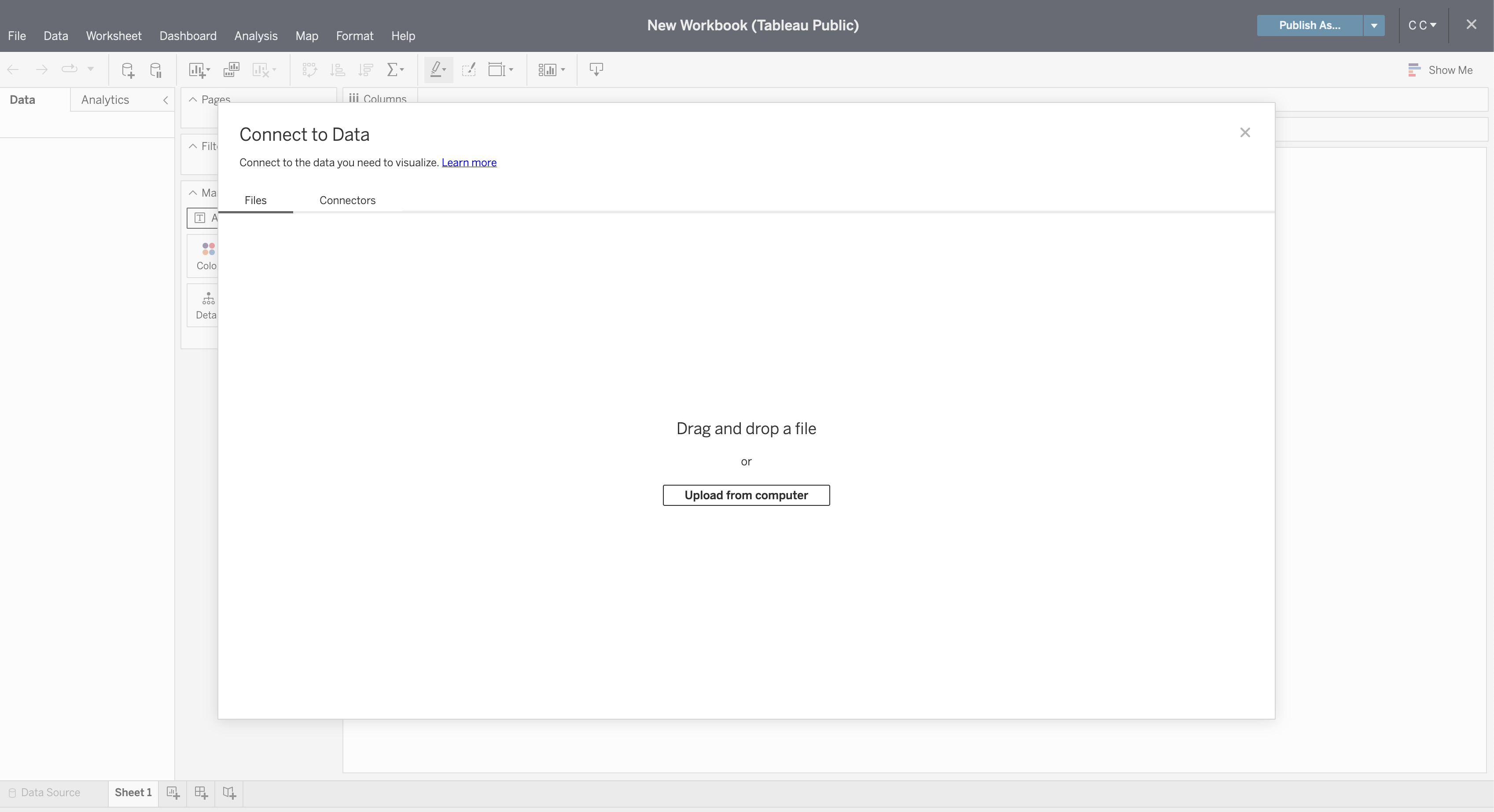
Once you've opened your first project, Tableau will ask you to connect to your
data. For this project, click the Upload from computer button and select the
CSV file previously combined in the step above.
Once connected, you can refresh the preview of the data with the Refresh Data Source button in the toolbar.
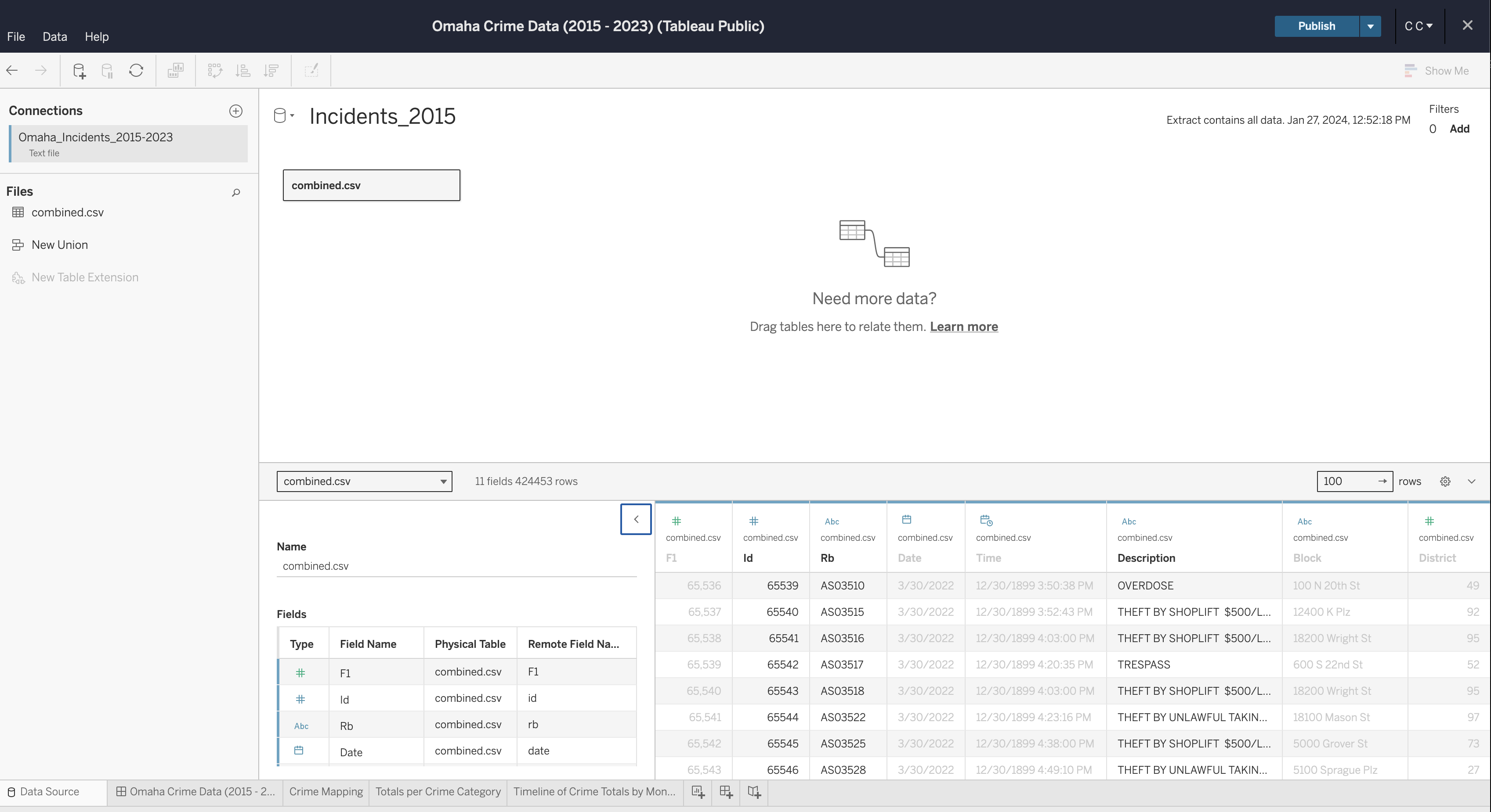
If you need to edit any of the data types, column names, etc., you can do so now. Once complete, generate an extract so that you can start creating visualizations.
Create Visualizations
To start, create a worksheet in the toolbar at the bottom of the screen.
Within this screen, select a column from the Data side bar on the left and
drag it into the Columns or Rows area of the canvas.
See below for the map visualization. You can recreate this by adding the following fields:
Columns: LonRows: LatMarks:- Description
- Datetime
Filters: Datetime
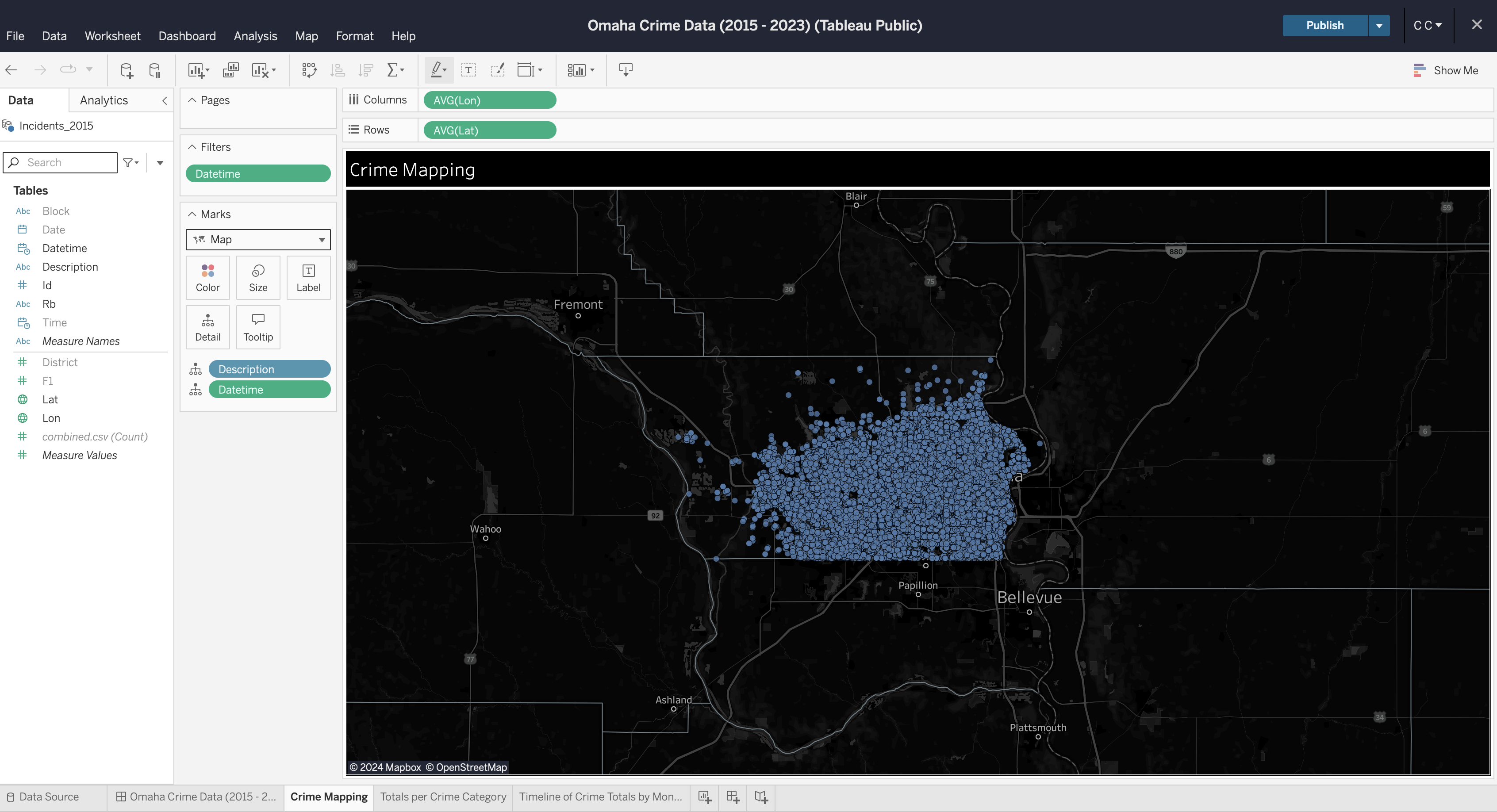
You can repeat this process for each visualization you want to create. Explore your options by dragging data fields to different areas and by opening the field options to explore what operations can be performed on different data types (e.g., average, count, etc.).
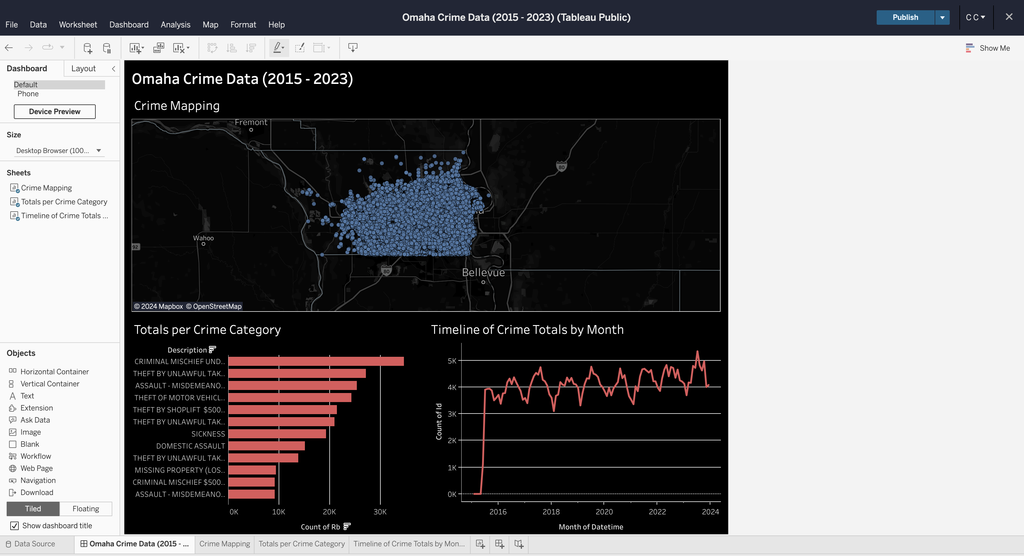
Create Dashboard
To create a dashboard, click the button on the toolbar at the bottom of the screen. Within the dashboard, drag each sheet from the left side bar onto the dashboard canvas.
Formatting
You can explore a ton of different formatting options throughout the worksheets
and dashboard. Specifically for maps, you can alter the map layers, background,
and visible features through the Map menu in the top file menu of the editing
screen.
In the finished dashboard below, I opted for a dark mode with a map that showed county lines and city names.
There's a ton of other options available to be used in a dashboard like this, but this project shows a quick preview of what you can do in Tableau Public.